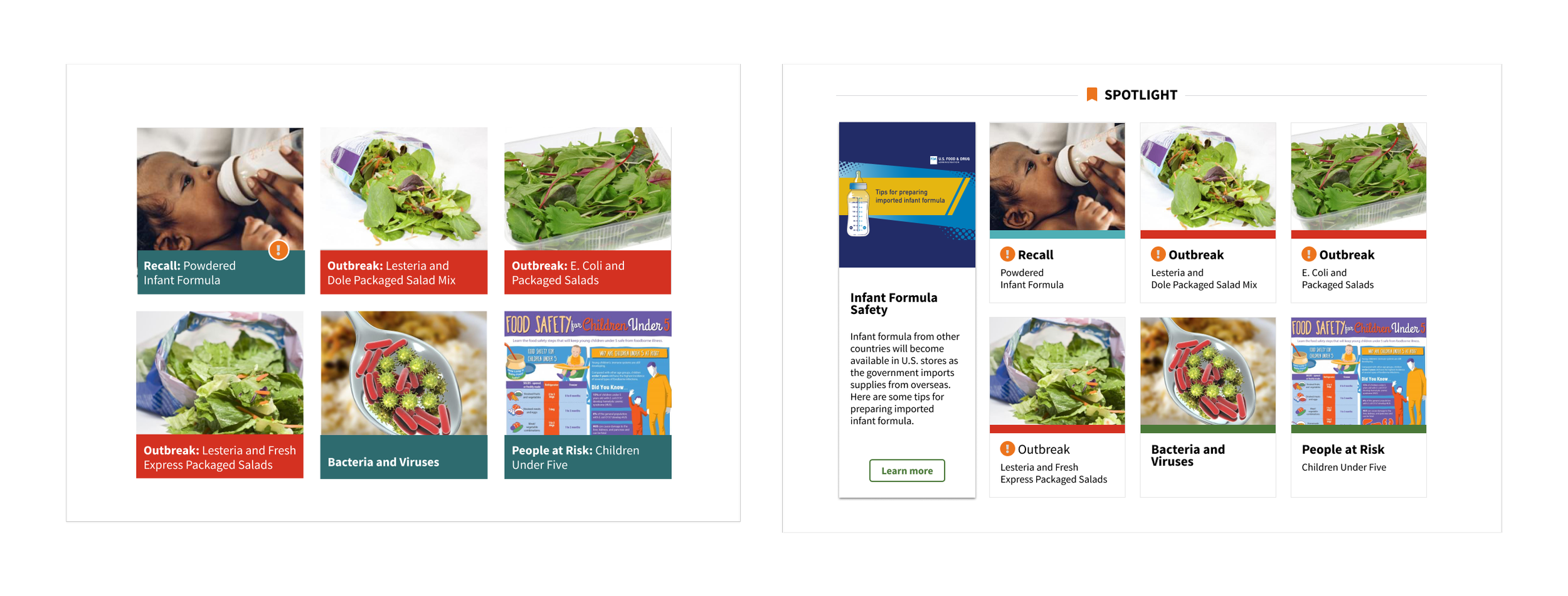
Foodsafety.gov - Spotlight Section
The Spotlight section serves as the main focal point on the website as it provides millions of Americans with vital information that includes recalls, outbreaks, and insures general food safety.
Role
UX/UI Design | UX Audit | Design Systems | USWDS
Team
1 Designer, 1 Developers, Product Owner
Problem
The Spotlight section on foodsafety.com presented significant accessibility challenges, with white text on a gradient background and images failing to highlight key information like outbreaks and recalls. These issues severely impacted user experience and usability, particularly for individuals with visual impairments or color vision deficiencies.
Furthermore, they hindered the website's ability to effectively communicate critical information to all users, undermining its overall usability. Given its status as a government website, Foodsafety.com must adhere to Section 508 compliance standards, emphasizing the urgency of addressing these accessibility barriers.
Discovery
To identify accessibility barriers within the Spotlight section on foodsafety.com, a comprehensive research approach was adopted, encompassing various methods to gather insights and understand user needs. Here’s we started.
Accessibility Audit
As a first step in unraveling the issues in accessibility, we collaborated with the Accessibility Expert on the team to assess the Spotlight section against established accessibility guidelines and best practices, identifying potential areas for improvement.
The findings provide a clear overview of the accessibility issues, their severity, impact, and recommended actions for improvement.
User testing
During the usability testing sessions, participants encountered several notable pain points within the Spotlight section, revealing critical accessibility challenges that hindered their navigation and information extraction.
Low Contrast Text
Users with visual impairments had difficulty reading due to poor color contrast, leading to frustration and comprehension issues.
Confusing Images
Users found image content hard to understand, particularly regarding outbreaks and recalls, leading to distrust.
Clear Presentation Needed
Users stressed the importance of concise, well-organized content with clear visual cues for critical information.
By synthesizing findings from user testing, accessibility audits, and user feedback analysis, a comprehensive understanding of the accessibility barriers within the Spotlight section was attained. These insights served as the foundation for guiding subsequent design decisions aimed at addressing identified issues and enhancing the overall accessibility and usability of the section.
Ideation
With a deep understanding of users' accessibility challenges from our research, our design team began iterative wireframing to revamp the Spotlight section on foodsafety.com. Drawing from user tests, accessibility audits, and feedback, our aim was to craft wireframes addressing pain points while enhancing overall accessibility and usability.
However, we hit a snag during the wireframing phase: depending on the image content, cropping issues arose, affecting the visual appeal within the designated card space. Despite this hiccup, we persisted in finding inventive solutions to uphold the visual integrity of the redesigned section.
Result
The implementation of design solutions derived from our iterative process has yielded significant improvements in accessibility, usability, and user experience within the redesigned Spotlight section on foodsafety.com.
Leveraging the principles of user-centered design and adhering to the standards set by the U.S. Web Design System (USWDS), the results showcase a marked enhancement in several key areas.
The redesign resulted in improved accessibility, addressing issues like low color contrast and confusing navigation, benefiting users with visual impairments. Usability testing showed reduced frustration and smoother navigation. Positive user feedback highlighted improved readability and a clearer interface, meeting diverse user needs. Quantitative data post-redesign demonstrated increased engagement metrics, reflecting the section's enhanced usability and effectiveness.
The updates to the Foodsafety.gov - Spotlight Section are currently in development.
Takeaways
- Accessibility Focus: The Spotlight redesign on foodsafety.com highlights our commitment to inclusivity and user-friendly design.
- Collaboration and Guidelines: Effective teamwork and adherence to USWDS guidelines helped us turn challenges into opportunities.`
- Addressing Accessibility: This project underscores the need to resolve accessibility issues early, ensuring information is available to everyone.
- Future Design Standards: Our approach sets a new benchmark for accessibility excellence in future projects.


